Ever wonder who designed the Coca Cola logo and why people love it so much?
Experts put in a lot of thought in designing brand logos and for good reason.
A logo serves as a strong weapon for any brand. After all, it’s the first thing consumers notice when they’re rummaging through shelves at the grocery store. It’s how a brand differentiates itself from competitors and drives customers into making a purchase decision.
So, it’s interesting to wonder how your favorite brand could have turned out had it opted for a completely different identity. Take Coca-Cola for example – can you imagine drinking a bottle of coke without that unique scripture?
Probably not. But the logo we see today isn’t what the brand initially started off with, though the brand has stayed committed to its original theme.
In this post, we’ll be discussing how Coca Cola’s unique logo has evolved throughout the years.
Table of Contents
Coca Cola Logo: The Beginning of Coke
It all started in 1886, back then Dr. John S Pemberton has just perfected Coca Cola’s formula and had teamed up with his bookkeeper, Frank M Robinson.
Robinson proved to be better in doing more than just his own job because he also came up with the name Coca-Cola and designed the iconic script logo. It was also he who cared to experiment with elaborate Spencerian script. Owing to its immaculate detailing, the script sought out to become one of the most recognizable trademarks to date.
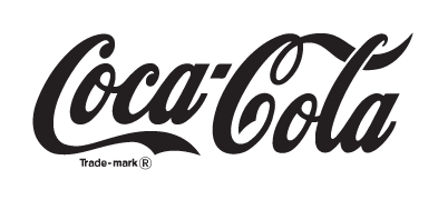
1887-1890’s: The Era of the Trademark
![]()
During this period (January 1893), the U.S patent office patented the logo. Notice how the word trademark has been printed on the letter “C”.
1890-1891 – The Era of Swirls
![]()
While this era was quite short-lived, it deserves a mention too. During this one-year period, the brand experimented with a dramatic swirly look. This makeover was probably the most unique, however, the brand quickly reverted back to its iconic scripture without the added swirls.
1941-1960’s – The Era of the Tail Tweak
In this era, Coca-Cola made a pretty smart move by placing the words “Trademark Registered” outside of the “C” instead of leaving it in. The words were then moved below the logo in hopes to improve the aesthetic appeal of the logo, which it certainly did.
1947-1960’s – The Era of the Red Disc
![]()
You’re probably no stranger to this stunning red disc thanks to vintage ads. This button sign was once popularly used to advertise Coca-Cola and set the ultimate paradigm for outdoor signage. These discs were heavily used for decoration and advertising purposes because of its aesthetic appeal during 1948.
You’ll also find these discs in print advertisements during the 1960’s, making it a popular Coca Cola logo.
1958-1960’s – The Era of Fishtails
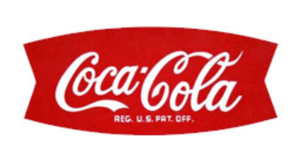
During this period, Coca-Cola used its iconic script into an arciform shaped structure – otherwise known as the fishtail sign. This logo was revealed in 1958 and was then used on vending machine, signs, cartoons etc.
However, in only a few years, the design was swamped back to the Red Disc. Experts noted that the circular designed deemed best in terms of visual associated with the brand.
By 1965 this design was phased out and replaced by the familiar Red Disc of earlier years. It was decided the red circle was the strongest visual association with the trademark.
1969 – The Era of the White Wave
![]()
This logo features the famous Coca-Cola script in a red box, underlined with a white wave. This logo is still popularly used today, owing to its spectacular design.
1982 – The Era of Diet Coke®
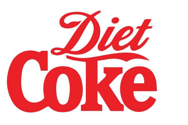
The 1980’s was an exciting time for Coca-Cola because that’s when it blessed the world with Diet Coke. The brand also came up with a bunch of cool coke slogans such as “Coke is It!” and much more.
The Diet Coke logo was the first to feature a change in font from the regular script to slab serif. The company also mixed and matched by swapping colors. They printed Diet Coke in bold red letters on a white background which was the opposite of what they had been doing before.
2003 – The Era of Being Real
![]()
The year 2003 kicked off with the “Coco-Cola… Real” campaign. This time around, the logo was further improved by adding some bubbles and a lovely splash of yellow.
2007 – The Era of Going Classic
Minor changes were made to Coca-Cola’s logo in 2007, the brand decided to oomph up the design by adding a single white ribbon.
2011 – The Era of Happiness
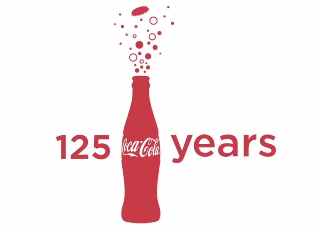
2011 marked a very special year for Coca-Cola as it celebrated 125 years of happiness. The anniversary logo featured bubbles bursting from a bottle to celebrate the success of Coke’s incredibly promising future ahead as well as all it has achieved in the past and present, kinda how you celebrate with a champagne bottle.
2013―2014 – The Era of You
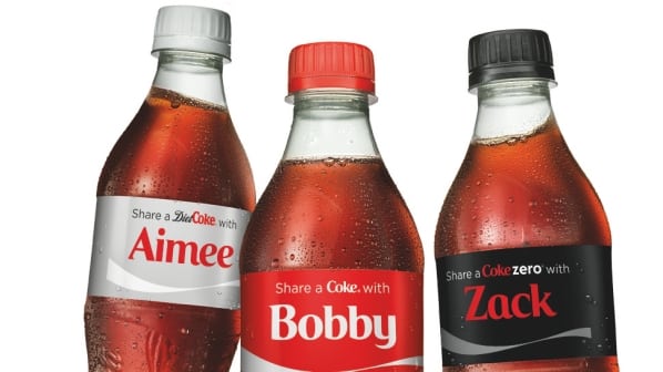
Now, this era is by far our favorite because it brought us Coca-Cola’s Share a Coke campaign. This campaign focused on intimacy by swapping Coca-Cola’s logo with your name. Sure, while this caused a major packaging change, the campaign was a huge success and hit more than 70 countries.
But it didn’t end there as Coca-Cola teams across the world pulled together to add their own creative spin to the campaign.
2016 ― The Era of Taste the Feeling
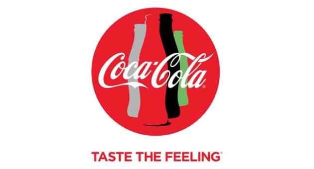
In 2016, Coca-Cola replaced its Open Happiness campaign to “Taste the Feeling.” This campaign used a more cohesive approach as all of Coke’s variants such as Coke Zero, Diet Coke, Coca-Cola Classic featured the same red disc logo.
This brand strategy highlighted how all these unique flavors are a part of Cola-Cola’s big, happy family.
Coca Cola Logo: Wrapping it Up
We hope you’ve enjoyed reading about the evolution of the Coca Cola logo and the story hidden behind each design.
Is there something you’d like to add?
Tell us about it in the comment’s section below.