Print advertisements have come a long way as they make one of the oldest and most successful means of promotion for businesses all over the globe. However, in today’s time of viral videos and social media, a lifeless picture printed on a limited newspaper or magazine space, may not seem to be very promising to many business entrepreneurs. And, while most of us were busy debating about the demise of print advertisements altogether, some of these intelligently creative print ads of 2012, made us change our view, and gave us some actual reasons to put a pause to such debates for now.
11. Apple iPad mini
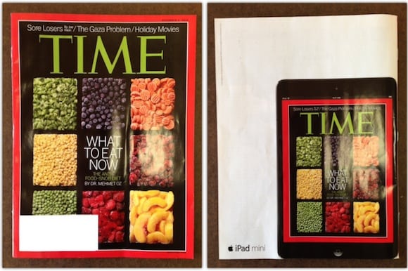
On number 11 we have this intelligently designed iPad mini ad that appeared on a number of popular magazines like Time, The New Yorker and Wired. The ad was printed on the back page of these magazines, which showed the Apple tablet in its actual size, displaying the front cover of the same magazine. Talk about creating illusions through advertisements!
10. Harvey Nicholas
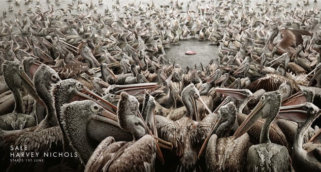
This picture showing a flock of pelicans crowding around a fish, depicts the Harvey Nicholas sale scene. So better be ready to fight, and get your hands dirty because at this designer clothing store, there certainly aren’t enough fish in the sea!
9. Sunlight Dishwasher Detergent
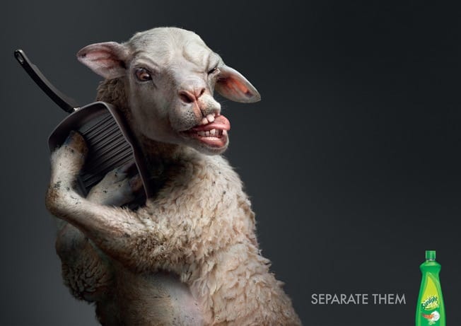
This creatively designed ad, shows how out of the box thinking can attract customers towards your product. The ad shows a sheep clutching tightly to a kitchen utensil, and the slogan of the dish-washing detergent simply reads. “Separate them.” So there you go, the advertising concept said in just two words, and the impressive illustrations give an extra point to the ad itself.
8. Kielo Travel
This ad makes me realize how beautiful simple things are, and sometimes, meaningful too. This Kielo Travel advertisement shows a doodle drawn around the ring of a box file to make it look like a pool handle. Sometimes, in order to make great ads, you just need to bring up simple thoughts, and make them extraordinary.
7. Volkswagen
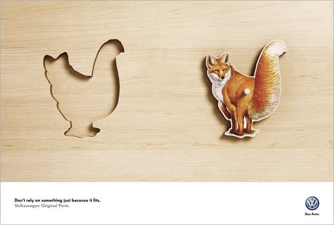
This ad designed for the Volkswagen company, shows a puzzle piece picturing a fox, while the puzzle hole looks like that of a hen. The message below reads, “Don’t rely on something just because it fits.” The ad cleverly places emphasis on buying only original Volkswagen car parts, instead of getting something that would just fill in the space.
6. Star Models
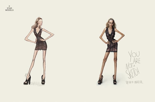
This anti-anorexia campaign started by Star Models gained a lot of publicity worldwide, and recognition from the Press Lions at Cannes. This print advertisement, shows a fashion sketch, along with a similar looking, just-as-skinny model, and the message below reads, “You are not a sketch, say no to anorexia.”
5. OndAzul
This brightly pictured print advertisement created for a Brazil based NGO evokes the environmental dangers our world is facing. The picture shows a sardine tin opened to reveal a tiny plastic bottle stuffed inside. The slogan reads, “Is this what you expect to find in the sea? Neither do the fishes.”
4. UNICEF
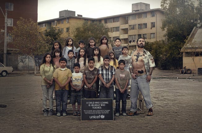
This print ad by the Unicef organization portrays a great message. The picture shows a group of young kids along with a big guy, holding a gun in his jeans. The message on the ad reads, “A Child Who Learns is an Adult Who Teaches.”
Therefore, this Unicef ad intelligently places emphasis on proper education for children, stating the fact that only good education can create healthy citizens for the society.
3. ANLCI
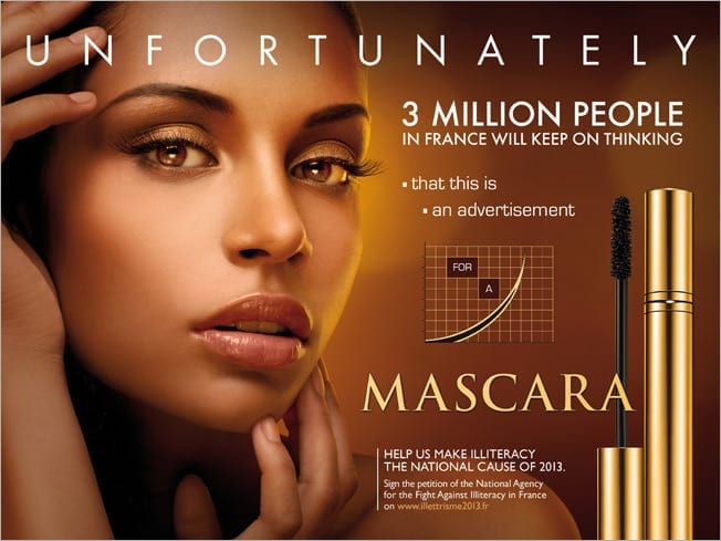
Yet again, a brilliant ad campaign with a very innovative concept. This advert is for ANLCI, a French government agency, working to create literacy awareness in the country, that came up with a series of fake ads, with a completely different message. This ad below, at first may look like an advert for cosmetics, but in fact, the ad reads that around 3 million people in France would not realize that the ad is actually aimed against illiteracy.
2. Crisis Relief Singapore
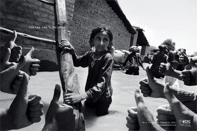
This thought-provoking ad was designed for a non-profit organization in Singapore working for the rehabilitation of disaster-affected people. The picture shows a little girl in a flooded village, and numerous hands showing the thumbs-up sign. The message directed towards the sharing and liking of such disaster struck places on the social media reads, “Liking isn’t helping.”
1. Times of India
This print advertisement, reading “Hang me again” shows pictures of Indian farmers who put an end to their lives of misery by committing suicide after being plagued by droughts, debts and lack of income. The Times of India started a campaign by creating portraits of these farmers who became victims of the harsh living conditions in India, and selling them to generate money for their families.
Some of these campaigns are really powerful and impactful. What do you think?





2 Comments
Well wrtten! :)